Jessica Hewlett, Zipline’s Graphic Designer

I’m fresh out of college, in a transitional period of my life and hungry for work. Fast forward to December and I meet the team from Zipline, a startup that’s picked up a ton of speed, in a major transitional period and hungry to help retailers all over the world drive better store execution.
Research. Interviews. Portfolio reviews. And now I’m on the marketing team. When I landed the job, one of the first projects I was asked to manage was the company rebrand. What went through my mind? Panic? Excitement? A little bit of both?
I was only a few months out of school and had never run a rebrand project, but was nevertheless thrilled to take on a leadership role at this amazing company and work to create a brand that would consistently represent their credibility and philosophy around communication. (In short, I was pumped!)
So where did we start and what did we end up with?
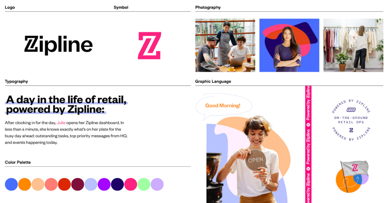
Changes with the logo
Our original logo was simple and efficient, but lacked the edge (and a little bit of spunk) that Zipline carries. It was a combination of the Zipline “Z” and the Zipline wordmark, in all caps text. This new logo collapses both of these elements down into a simple and efficient mark. In a bold, fresh font, it conveys simplicity while maintaining it’s chops. To balance the boldness, Zipline’s new mark is in title case instead of upper, to remain approachable and light. The “Z” itself was edited to match this weight, with small inkwells in the corners that create tiny delights, as well as reflect the rest of the wordmark.
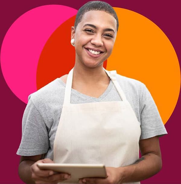
How was photography approached?
We’ve all seen the generic stock photos of store employees and executives, but Zipline is anything but generic. When looking at different styles, we wanted something that shows real life employees doing real work. In this “lifestyle” look, Zipline’s brand photography captures an approachable, down to earth and most of all authentic feel; something that we pride ourselves on bringing to our customers as well.
There’s a LOT of colors. How is the palette handled?
Sometimes less is more, but sometimes having a little extra can be a lot of fun. This palette’s colors range from deep blues and burgundies to bright greens and purples. While I am absolutely in love with them all, they had to be reigned in to create a consistent brand look. To achieve this the colors are separated out into a conservative primary group, with the others to act as accents. Zipline’s primary palette is, at its base, an updated and more colorful version of the original. The classic Zipline pink was transformed from a highly saturated magenta to a lighter and more vibrant shade falling closer to the color of punch (and it most certainly packs one). The remaining colors are a variety of blues to offset the pink and provide beautiful contrast to the brand. The secondary palette functions not only as an accent to the primary, but also creates moments of vibrance with pops of color.
Out of all of these new brand elements, which am I most excited about?
How do I even pick? The colors, fonts and other design elements have such a perfect balance between authenticity and approachability while carrying a bold and vibrant tone. If I had to choose however, I would have to say I’m most excited about the graphic treatment we use in our lifestyle photography. To take these images one step further into reflecting the Zipline brand, organic, multicolored shapes were introduced to add another layer to their look. These shapes carry out three main functions. At a very simple level, they add depth to Zipline’s design by floating between the background and foreground of our photography beautifully. Secondly, they provide another opportunity to bring in the colors of Zipline, especially in photograph-heavy pieces where they may not have lived before. Finally, and most importantly, these graphic elements allow us to do the one thing Zipline loves most: highlight and feature our customers as heroes. Being organic in nature, I have the ability to morph these shapes into anything: from a stream that conveys movement, to a backdrop of abstract wings that puts our customer in the spotlight.
So what did I learn from this experience?
The phrase “drinking from a firehose” comes to mind. Over the course of the past seven months, I’ve learned so much about this company and the brand it represents. As far as my career goes, I’ve gained first hand experience working with a design agency on behalf of a company. (In the past, I had been a designer working for a client.)
Since Zipline is a fully remote company, I learned about working asynchronously and managing time effectively, since I had to capture and distill everyone’s feedback and opinions as they rolled in, mostly using Basecamp.
The learning experience continued when our new brand was delivered since I was responsible for taking the new identity and applying it to all of our company’s materials, working with everyone across the company to ensure their needs were met. I also learned how to convey new brand elements to non-designers across the company and why consistency is so important. I became an educator on design and our brand, and loved that role.
Being brought into this company, and this rebrand project has been an incredible experience, filled with so many wonderful design elements.
Recent Posts
Company News
Zippy is Officially Here!
Employee Engagement
NRF 2025 Day 3 Insights
Industry Trends
NRF 2025 Day 2 Insights
Industry Trends
NRF 2025 Day 1 Insights
Industry Trends
NRF 2025 is your best NRF yet!
Company News
Your ultimate fantasy retail team: Zipline, Legion, RetailNext
Company News
Meet the Retail Rockstars at NRF 2025: Learn, Network, and Get Inspired
Company News
Lighting Up Times Square: A Love Letter to Store Employees
Company News
Zipline Named a Finalist for the NRF VIP Awards!
Retail Communications
How Visionworks Brought Comms into Focus with Creative Hubs
Retail Communications
How L.L.Bean Made Store Communication Awesome